Like in the 2010 post–apocalyptic film Book of Eli, much of the world’s literary knowledge vanished without a trace after a doomsday event, which (in the film) was said to be a nuclear holocaust triggered by ecocide. Some books somehow survived, but they’re so rare that Eli has to travel through the wastelands, fight a warlord and his henchmen, escape cannibals, and actually die to preserve one of the few remaining books in existence. Digital technologies and devices turn into paperweights, so records of the thousands of typefaces are inaccessible too. If you feel the need to save a typeface or two for life after the collapse, here are some ideas for impactful post apocalyptic fonts.
Whether a nuclear disaster, asteroid impact, zombie outbreak, pandemic, or extreme climate change, the eventual impact on the human population would be just the same. Billions of people die, and modern civilization will soon be no more because there’s just not enough people to maintain essential infrastructures. Your laptops may still work for a time but only until the electric grid is running out of power – that is if the generators haven’t been destroyed during the initial onslaught. And if you need to scavenge for sustenance through the vast wasteland, the solar panels on your roof are as good as nothing.
What the Professionals Say
Jason Smith, the creative director at the London-based design studio Fontsmith, says that we need to save Helvetica for the sole reason that the apocalypse is likely to happen when the world is set in that typeface. His next pick is Sabon for its rich history and nice proportions, so that we can remind ourselves every now and then in the unbearable post-apocalyptic days that we were once pretty good designers. For all other practical purposes, however, Mr. Smith suggests we use Star Trek fonts (Horizon) just because that’s how typography is supposed to look in the future.
| Helvetica | 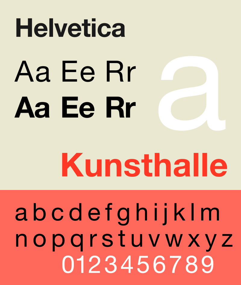 |
| Sabon | 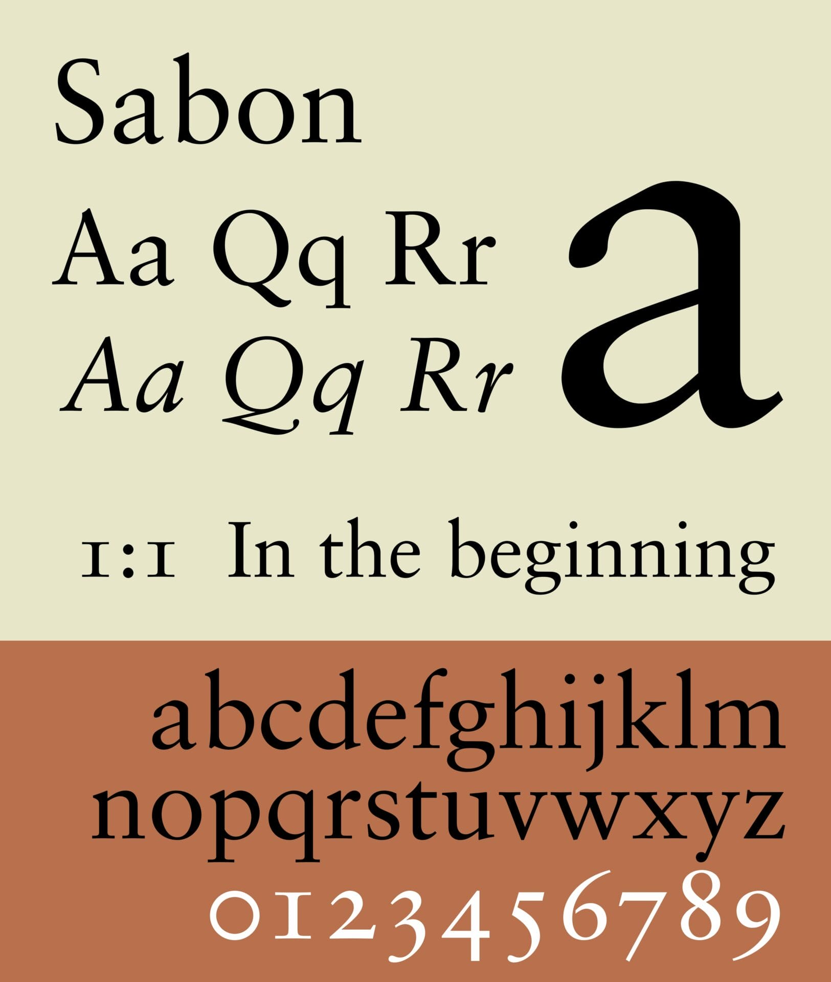 |
| Star Trek | 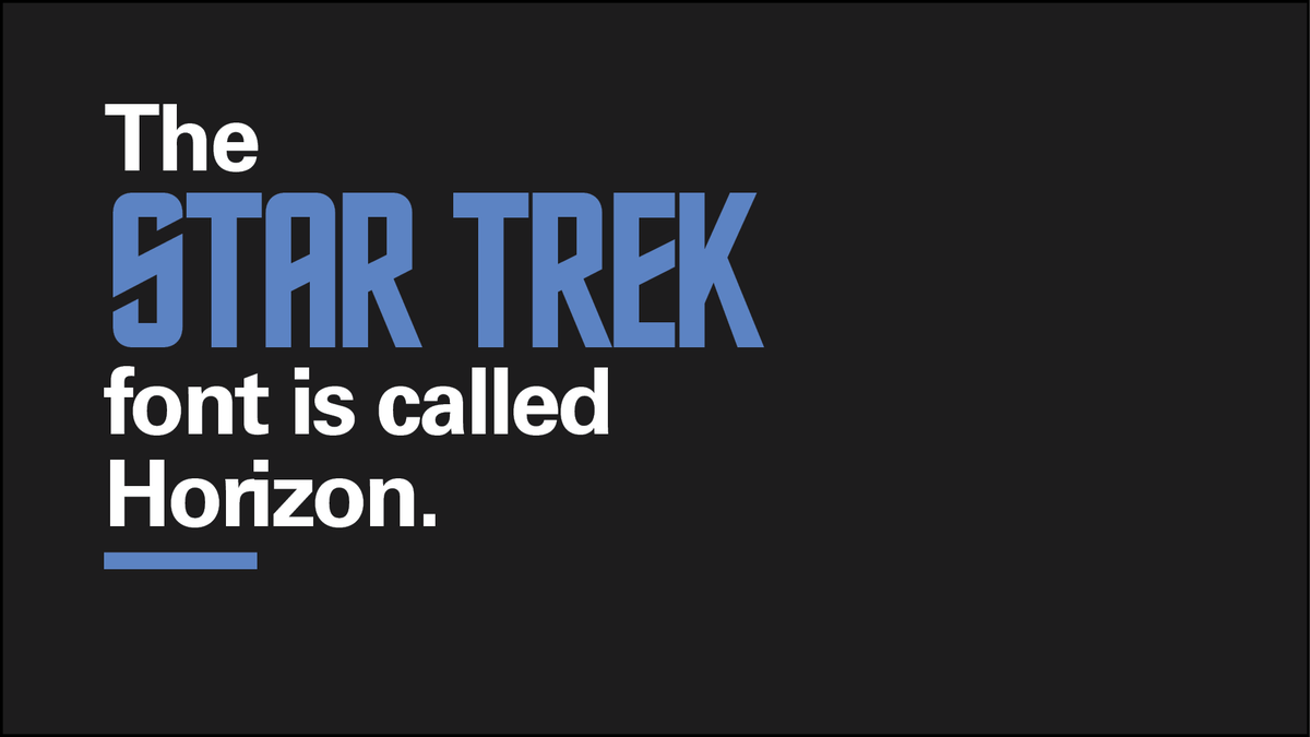 |
Bruno Maag, the founder of Dalton Maag, takes a completely different approach. He thinks Helvetica deserves to go extinct and we must instead preserve the original Univers. If more fonts are absolutely necessary for variety, Mr. Maag has no problem using either Clarendon in its thick form or the Klingspor Gotisch. He picks all three not for their legibility or overall usefulness, but simply because he sees them as works of art.
| Univers | 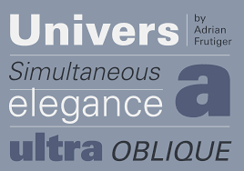 |
| Clarendon | 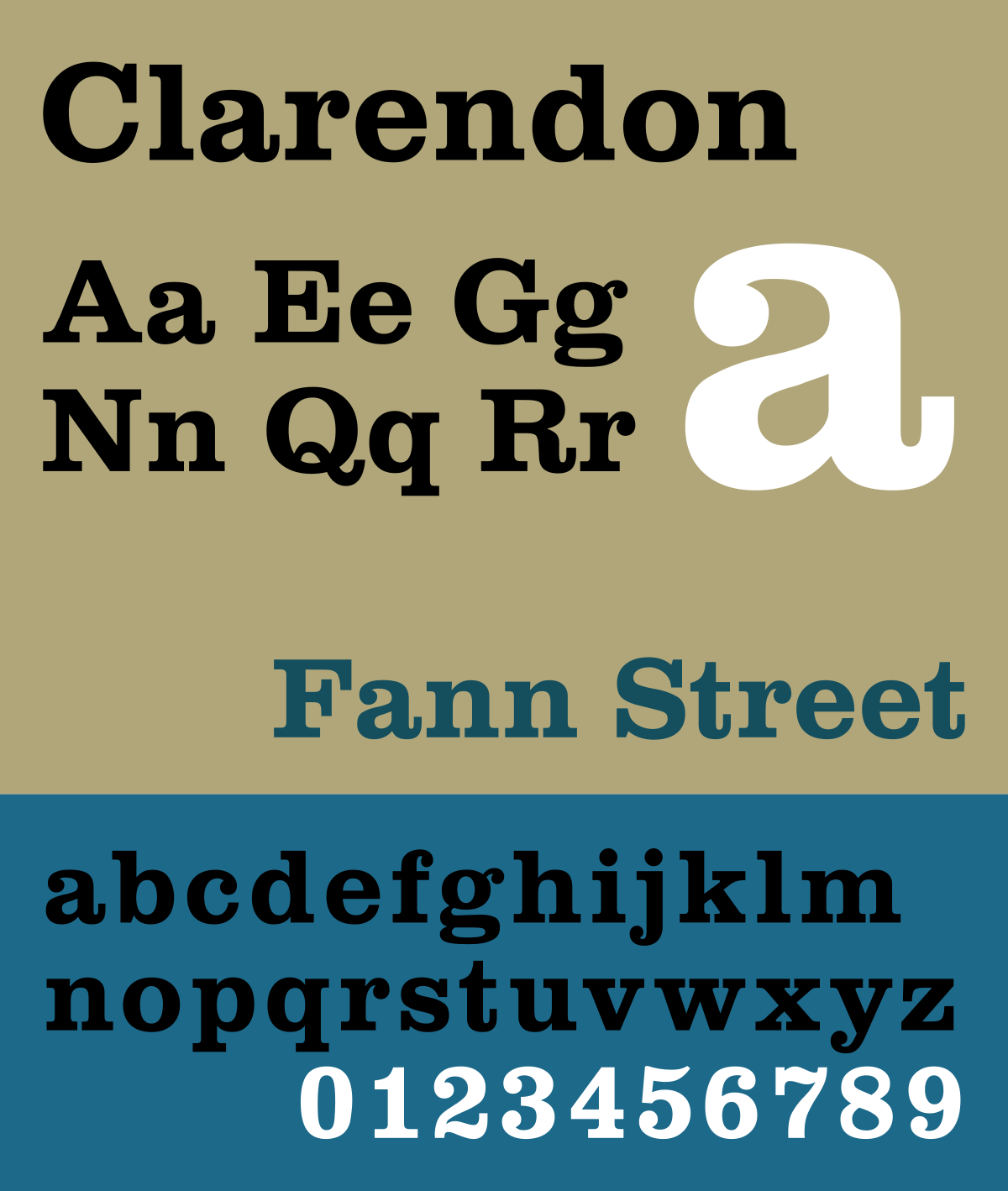 |
| Klingspor Gotisch | 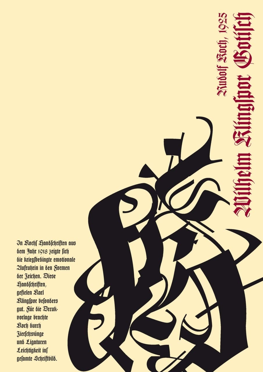 |
Danny McNeil from Sea Design agrees with the idea of Ryman Eco being an environment-friendly typeface. If somebody could find a working printer and a reasonable supply of ink, the font should help us save on cartridges and still allow us to produce a large pile of safety flyers to warn scavengers of radiation zones and mutant-infested areas. For the sake of adapting to the new world, the New Alphabet is good as a secondary font, but mostly for educational purposes.
| Ryman Eco | 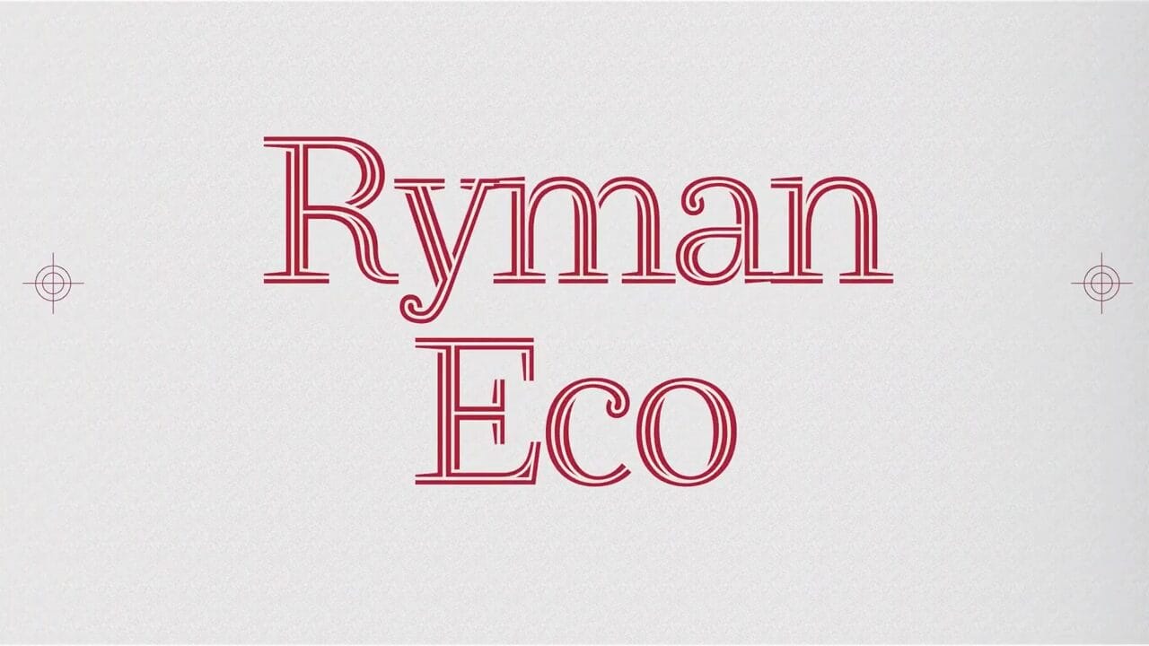 |
| New Alphabet | 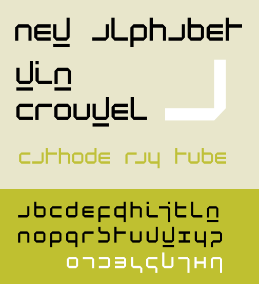 |
| American Typewriter | 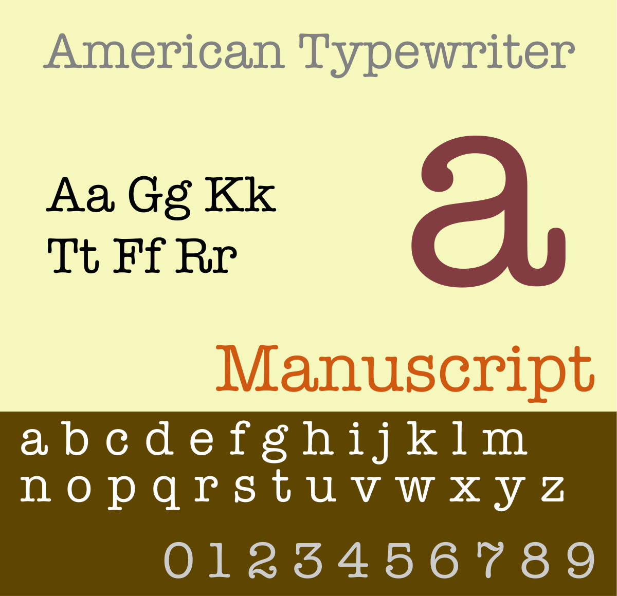 |
| Microsoft Sans Serif | 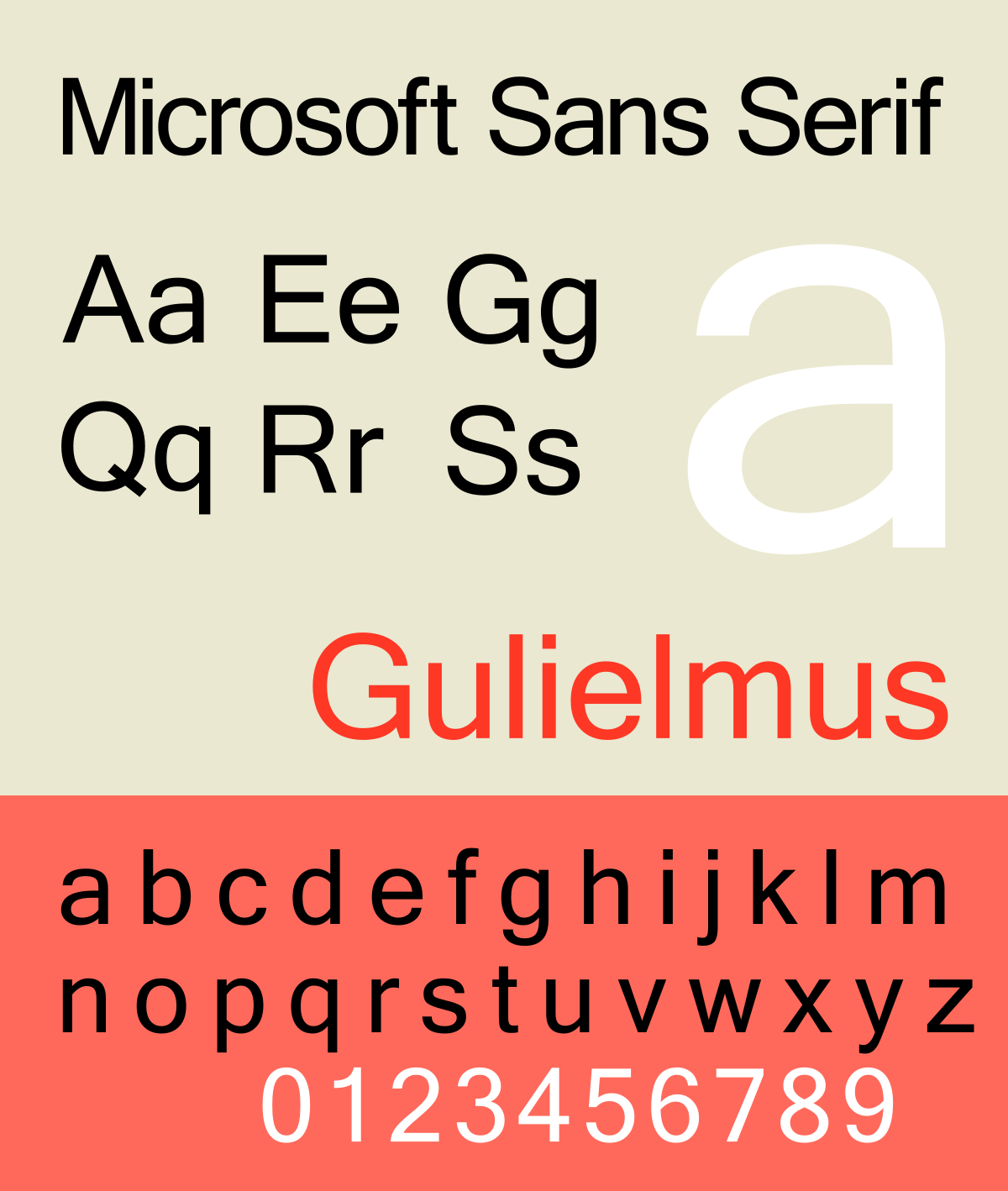 |
| Mercury | 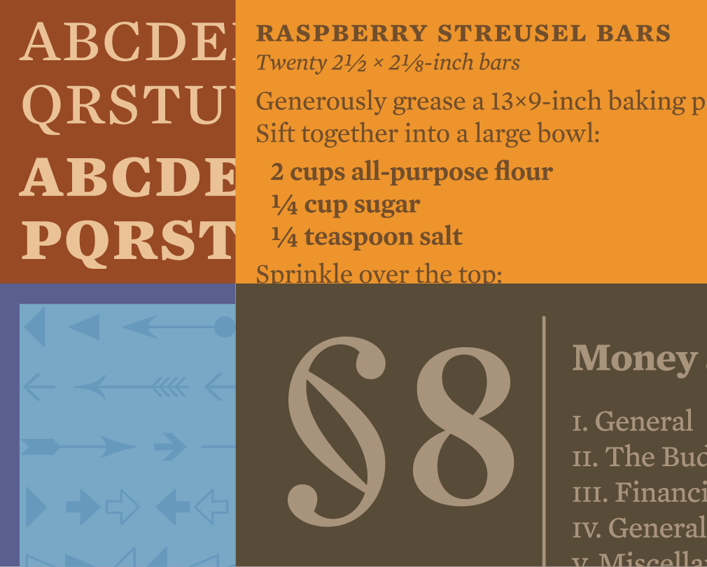 |
| Comic Sans |  |
Morag Myerscough, the person behind Studio Myerscough, prefers Typewriter condensed for its timeless look, which means it should remain perfectly usable regardless of the era, even a post-apocalyptic one. A bold sans serif also makes sense because it looks clear on just about every surface. Meanwhile, Planning Unit co-founder Jeff Knowles likes how Mercury typeface can project both modern and classic appeals in one package. And finally, he recommends we make peace with Comic Sans as it is going to survive the apocalypse anyway.
Fun Fonts
But you don’t have to play by their rules. Sometimes, you just want to have fun and play with striking fonts to make a statement. It is not just about aesthetics and legibility; setting the mood is often most important if you want your written words to stand out in the ruins.
Blanka: it is so minimalist that some bits are missing from the letterforms. Nevertheless, words and sentences are still very readable. Most of its uses are for large displays and signs, presumably created with Caps Lock on.
Stalinist One: a utilitarian, non-nonsense typeface featuring sharp corners and bold lines. Stalinist One is at the same time straightforward and intricately designed, just like post-apocalyptic survival.
| Stalinist One | 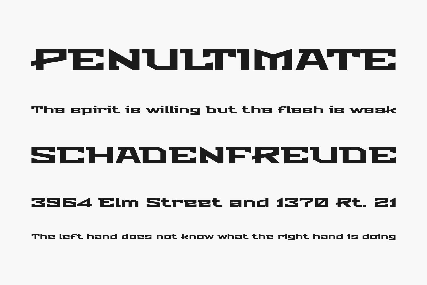 |
| Blanka | 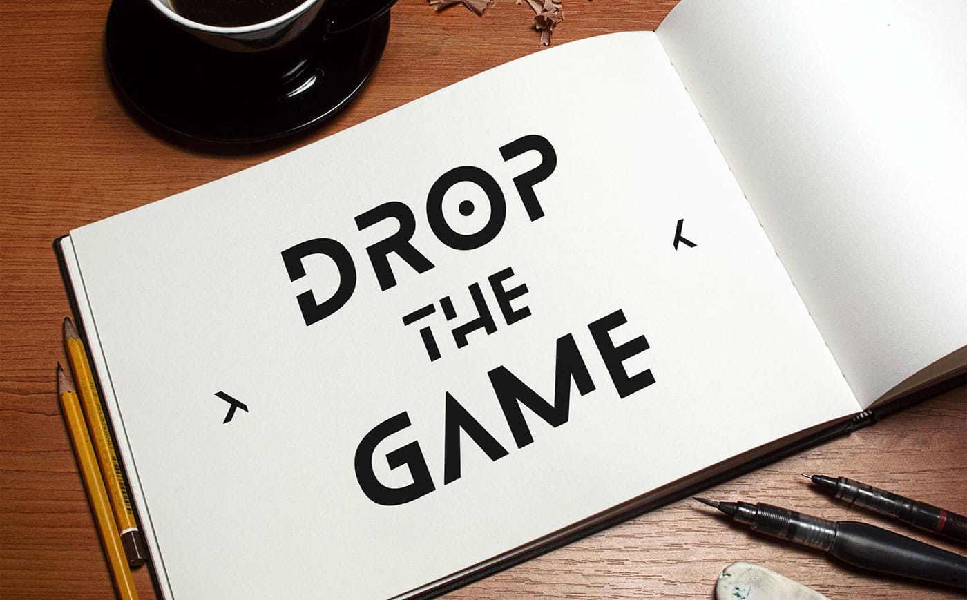 |
| Orbitron | 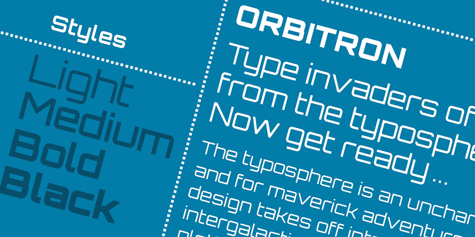 |
Orbitron: since the 1960s, square sans serifs have been associated with hi-tech and everything sci-fi. Naturally, typefaces like Bank Gothic and Eurostyle dominated movie posters, book covers, and news headlines in the decade. Orbitron is actually modelled after those two, but its post-apocalyptic vibe and stylistic design touches will easily make any word appear more prominent.
We think that when it comes to typography, the post-apocalyptic world is as freestyle as it can get. You can actually use any font you like, but certain typefaces can definitely convey messages better than many others. Although it is possible to turn to something a little more conventional like Lucida Console, Papyrus, or an extra bold Rockwell, you can do a lot better with typefaces that actually scream post-apocalyptic.
If there were still newspapers in the post-apocalyptic world, what fonts would they use? Can zombies read? We’d love to hear from you.
Other Things You Might Want to Know
Who invented Comic Sans?
Typographer Vincent Connare created the famous typeface for Microsoft in 1994.
What is the most widely used typeface?
Helvetica remains the most popular font on the planet. It has been used everywhere from formal documents to TV subtitles since the 1950s. Baskerville and Times come close at second and third places. Gotham and Futura are also immensely popular in the advertising and graphic design industries.
Where can I get fonts?
A plethora of websites where you can get both free and premium fonts, for examples:
- Google Fonts
- Font Bundles
- Behance
- Dribbble
- Font Squirrel
- 1001 Free Fonts
- FontSpace
- UrbanFonts
- DaFont
Check out other articles by month:

